How Simple Coffee Built a Daily Management View for 26 Locations
The project connected R-Keeper, normalized inconsistent product catalogs and turned more than 240,000 monthly transactions into a daily operating view.
- 26
- locations in project scopeThe number describes the implementation scope, not the current store count.
- 240k+
- transactions per month
- Daily
- scheduled data refresh
- ≈3 months
- to the first network-wide system

Simple Coffee is a multi-location coffee business in Yekaterinburg. This case describes the implementation scope documented at the time of the project.
The scale made a monthly answer too late
At the time of the implementation, the documented project scope covered 26 Simple Coffee locations in Yekaterinburg and more than 240,000 transactions a month. The network had operated for more than a decade, with established controls, reporting habits and a large history of operational data.
Management could assemble a retrospective picture in Excel, while detailed sales data remained inside R-Keeper. Getting a specific answer often meant opening a difficult source-system report or asking another person to export it. By the time the monthly report was ready, a weak location, an expensive product mix or an unusual discount pattern had already been accumulating for weeks.
The objective was not to declare every spreadsheet obsolete. Some factual financial control continued in Excel. The objective was to give management, marketing, purchasing and development a shared daily operating model that could be compared with those controls and investigated down to an individual transaction.
The first question: what needs attention today?
The first release was organised around a recurring management question rather than a collection of charts: which locations, products and operating periods require attention before the end of the month?
Five measures formed the daily starting point in the client’s later usage review:
- Sales across the network and by location.
- Transaction count.
- Average transaction value.
- Items per transaction.
- Theoretical food cost for the network, category or product mix.
A daily pipeline, not a manual export
We built a custom connection to the R-Keeper API and a scheduled ETL process. Source records were retained in a raw layer, transformed in a separate clean layer, assembled into decision-specific marts and then published to DataLens.
The refresh was daily rather than real-time. That cadence matched the decisions in scope and made the pipeline easier to reconcile and support. A manager could see a current operating picture without turning the source system into an analytical interface.
- R-Keeper
- ETL
- Raw
- Clean
- Marts
- DataLens
The difficult part was making historical products comparable
The same product was not always recorded in the same way across locations and periods. Categories had changed, names differed and modifiers did not consistently follow one catalog logic. Loading those records directly into a dashboard would have produced precise-looking but misleading assortment and food-cost views.
We aligned the master catalog, introduced explicit mapping rules and added checks at the input boundary. Raw source values remained available for audit; the clean layer carried the agreed analytical classification. This did not make every historical record perfect. It made the rules visible, repeatable and testable.
That distinction matters in almost every BI implementation: the dashboard is the last layer. Trust is created by the definitions, mappings and reconciliation work underneath it.
One system, different views for different decisions
The management layer covered the whole network and individual locations, assortment and unit economics, discounts and loyalty with drill-down to a transaction, sales by daypart and comparisons between weekdays and weekends.
Senior management could review the network and compare the theoretical model with factual controls. Marketing could inspect product and category performance. Purchasing could use seasonal sales and recipe data to plan consumables. The same foundation supported different questions without giving every role the same overloaded screen.
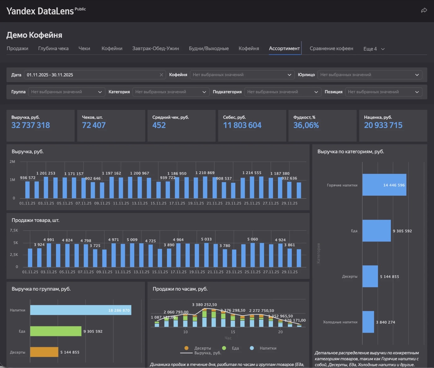
An anonymised public demo based on the same management logic. Demonstration data is shown; the original interface is in Russian.
The operating change was broader access to the numbers
The useful change was not simply that a dashboard existed. People outside senior management could obtain the same daily view without navigating R-Keeper or waiting for an export. In a July 2026 usage interview, Simple Coffee described the change this way:
“Once DataLens was introduced, we started seeing these figures every day. Previously, only senior management saw them; now another three or four departments pay attention to them.”
What the team did with the evidence
Marketing used product history, sales mix and theoretical food cost to judge new assortment ideas and understand the response to price changes. The team removed poorly performing snack bars, postcards and sticker packs and rebuilt the checkout-area range when the data showed low sales and unsuitable food cost.
Purchasing used seasonal menu sales and recipe data to estimate how many branded summer cups to order. Simple Coffee reported that the view helped avoid building excess seasonal inventory that would have been unusable after summer. The financial amount was measured by the client but was not disclosed, so this case does not invent one.
These are bounded examples, not a claim that a dashboard autonomously made the decisions. The value came from combining accessible evidence with people who owned assortment and purchasing choices.
What changed—and what this case does not claim
Within roughly three months, the project produced a network-wide system with daily updates, role-based views and transaction-level investigation. It reduced dependence on manually assembled monthly reporting for operational questions and made discrepancies easier to locate and discuss.
The documented result is a faster, more explainable management process. It is not a claim of real-time data, perfect source records, a complete abandonment of Excel or a guaranteed margin increase. Those boundaries are important: they separate an implemented operating system from a polished ROI story that the evidence cannot support.
- Daily operating view instead of waiting for a monthly retrospective.
- Shared definitions and normalized catalogs instead of silent category drift.
- Role-specific views instead of one universal dashboard for everyone.
- Drill-down to the transaction behind a suspicious aggregate.
- A foundation that can evolve as management questions change.