Why Dashboards Don’t Change How Companies Are Managed
A practical way to tell whether BI is merely visible or has become part of how decisions are made, assigned and reviewed.
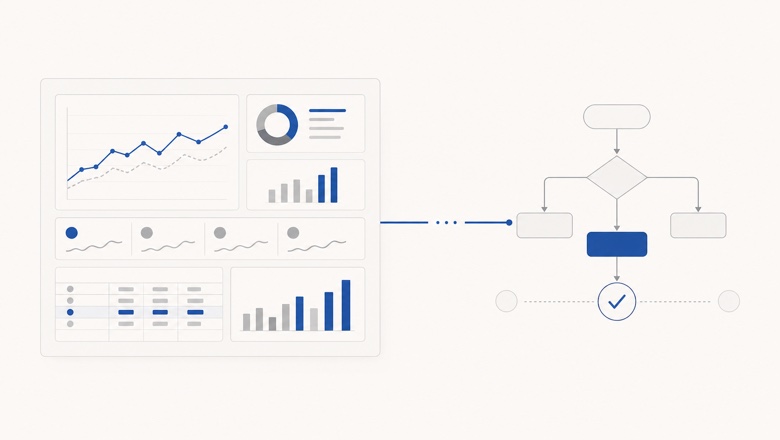
The dashboard makes a signal visible. The operating loop determines whether the signal changes anything.
A dashboard can be delivered without changing a decision
Most BI requests arrive as a request for an object: a sales dashboard, a P&L view, an inventory screen or one report for the management team. The object is easy to describe and easy to put into a project plan. The decision behind it is usually less explicit.
This is why technical go-live and management go-live are different events. A dashboard may refresh on schedule, reconcile with its sources and still sit outside the meeting where the decision is made. If the meeting continues in a spreadsheet, the dashboard has been delivered but has not yet been adopted.
The useful question after launch is therefore not only whether the screen works. It is whether a recurring decision has become easier, faster or more reliable because the screen exists.
Usage is not the same as adoption
Opening a report is evidence of attention, not evidence of a decision. A manager may check plan versus actual twice a week simply to stay oriented. That can be valuable: analytics can work as a management radar without triggering an action after every view.
The opposite pattern also exists. In one multi-location business we studied, an operating leader checked the core dashboard every day. When a location fell behind, the number led to a call and a review. A figure that had previously taken about 30 minutes to move into a spreadsheet was now available immediately. The clearest gain was not a dramatic revenue claim; it was a lower cost of getting an exact answer at the moment it mattered.
In another project-based company, the dashboard exposed over- and under-spent hours, but a regular project meeting still ran without it and the old spreadsheet process remained in use. The data product was useful, yet the surrounding management routine had not caught up. Both examples are anonymised observations from implementation work, not a universal benchmark.
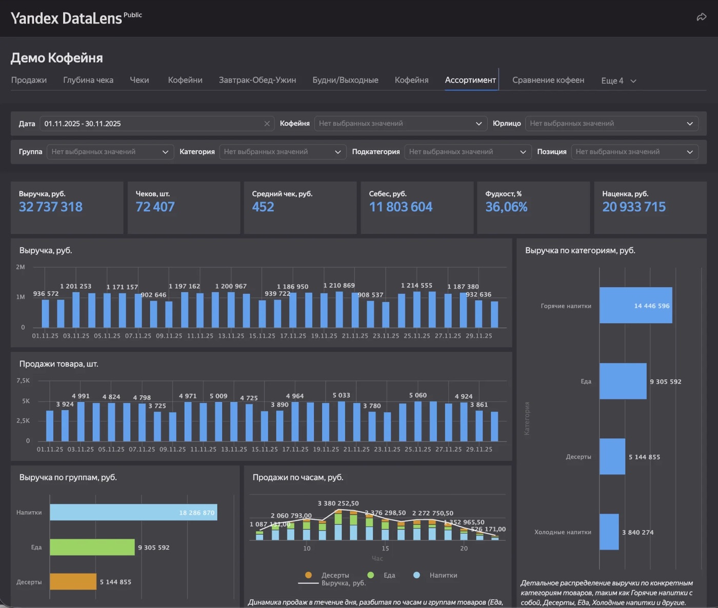
A public demonstration dashboard from our implementation work. The interface can expose the signal; adoption happens in the meeting and follow-up around it. Demonstration data is shown.
Start with the decision, not the screen
The same request can hide several different jobs. A founder, a sales director and a finance lead may all ask for a sales dashboard while needing different signals, levels of detail and moments of intervention. One universal screen for every role often becomes a compromise for every role.
Before choosing charts, define the recurring decision-making routine the first release should support. These questions usually reveal more than a long list of requested metrics:
- Who is expected to make or influence the decision?
- At what recurring moment is the information reviewed?
- Which number starts the conversation, and what counts as a meaningful deviation?
- Where do people currently dispute the figure or its definition?
- What source-level detail is needed to explain the deviation?
- What action can realistically follow, and who owns it?
The management loop a dashboard must enter
BI becomes operational when a signal travels through a complete management loop. The screen is only the first interface in that sequence. The rest belongs to the company’s meetings, roles and follow-up discipline.
A useful first release makes the loop cheaper to run. It gives the team a trusted starting point, lets them open the driver behind the number and reduces the time lost to rebuilding or defending the report. It does not automate the decision itself.
- Signal
- Discussion
- Decision
- Owner
- Action
- Review
A practical analytics adoption test
We use the following ladder as a practical diagnostic, not as an industry standard. It helps separate a technically complete dashboard from a management system that is actually in use.
- 01
Available
The report refreshes and the intended users can open it.
- 02
Trusted
Metric definitions are clear and important figures reconcile with their sources.
- 03
Reviewed
The report appears in a defined meeting or individual management routine.
- 04
Actionable
A signal can lead to a decision, an owner and a dated next step.
- 05
Closed loop
The team returns to the action and checks whether the intervention worked.
What to measure after launch
Page views can help diagnose reach, but they are a weak primary measure of BI value. A small number of senior users may generate little traffic while making consequential decisions. Look for evidence closer to the work:
- Time needed to answer a recurring management question with an exact number.
- Use of the report in the meeting or review for which it was designed.
- Actions, owners and follow-ups that begin with a visible signal.
- Manual exports and parallel spreadsheets that can be retired.
- Recurring disputes about definitions or source data that still block a decision.
- Questions users still cannot answer without asking an analyst or developer.
What dashboards cannot fix
A dashboard cannot create a process owner, settle an unresolved definition of margin or make a team act on a decision it does not own. It can expose those gaps more clearly, but visibility and authority are different things.
Sometimes replacing a manual export is enough. Not every BI project needs to transform how the whole company is managed. The important thing is to agree on the expected change before development, then judge the release against that expectation rather than against the number of screens built.
The real design question is not “What should the dashboard show?” but “Which decision should become easier?” Once that is clear, the data model, interface and adoption work can all serve the same purpose.