Data Quality Before BI: What to Fix First
You do not need perfect data to start. You need stable definitions, traceable transformations and reliable data for the first management decision.
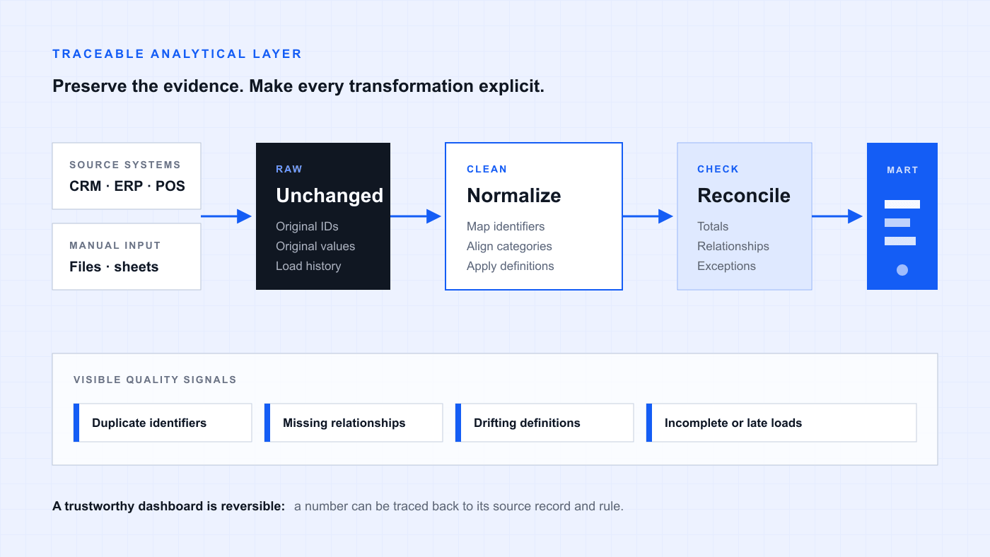
Keep source records intact, apply explicit mapping and reconciliation rules, and publish only the decision-ready layer to BI.
You do not need perfect data to start
Data quality is often used as a reason to postpone BI. First the CRM must be cleaned, the ERP catalog rebuilt and every old spreadsheet reconciled; only then, the argument goes, can the company start analytics. In a growing business, that finish line rarely arrives. New products, branches, systems and manual workarounds keep moving it away.
The opposite shortcut is just as risky: load every table into a BI tool, add charts and promise to clean the data later. The dashboard may look precise while combining duplicate customers, incompatible categories or two different definitions of revenue. A polished interface can make the wrong number feel more authoritative.
A workable first BI release sits between those extremes. It starts with one recurring management decision, identifies the data that can change that decision and makes that data traceable, consistently defined and reliable enough to use. Cleaning and normalization then happen inside the implementation, not as an endless project before it.
Data quality has three different layers
Teams often put every defect into one bucket called “dirty data”. That makes the problem sound larger and less actionable than it is. In practice, three layers need different owners and different remedies.
- 01
Technical quality
Are identifiers unique, required values present, types valid, relationships intact and scheduled loads complete? These checks can usually be expressed as repeatable rules.
- 02
Semantic quality
Do sales, finance and operations mean the same thing by customer, order, revenue, margin or completed course? A technically valid field can still represent the wrong business meaning.
- 03
Operational quality
Are people entering the necessary fields, maintaining catalogs and following the process that creates the data? A dashboard can reveal weak discipline, but it cannot repair the workflow by itself.
What normalization means in a BI project
In this context, normalization does not mean redesigning every source database into textbook normal forms, and it does not mean scaling numeric features for machine learning. It means turning inconsistent operational records into a stable analytical language without erasing where they came from.
The exact work depends on the decision in scope, but it commonly includes:
- Mapping one entity across systems through stable customer, order, product, location or employee identifiers.
- Aligning names, categories, units, currencies, time zones and status values.
- Defining how returns, cancellations, backdated changes and manual adjustments affect a metric.
- Separating raw source records from the cleaned layer so every transformation remains auditable.
- Creating reference tables and data marts around a defined management question rather than around every field available.
A field example: when the catalog makes the dashboard lie
In our public Simple Coffee case, the project covered 26 locations and more than 240,000 transactions per month. The technical connection to R-Keeper was only part of the work. Historical product data was not fully consistent: the same item could be recorded differently across locations, categories had drifted and modifiers did not always follow one catalog logic.
If those records had gone straight into charts, assortment, food-cost and margin views could have looked coherent while grouping unlike items or splitting one item into several versions. The defect was not visual. It changed the management interpretation of the number.
The solution was a layered flow: retain raw records, align the master catalog, define mapping rules, add input quality checks and build analytical marts from the cleaned layer. This did not make every historical record perfect. It made the transformations visible and the decision-critical outputs reproducible and reconcilable.
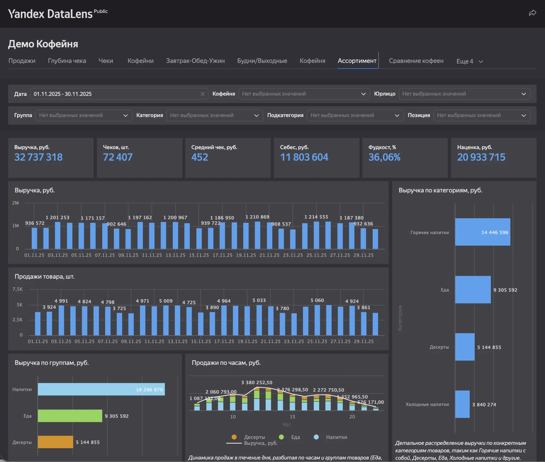
A public demonstration dashboard based on the same management logic. The visible chart is the last layer; the catalog, mappings and checks underneath determine whether it can be trusted. Demonstration data is shown.
A practical sequence before the first dashboard
The goal of an early data-quality pass is not to produce a general cleanliness score. It is to reduce uncertainty around a specific decision. A useful sequence is short enough to run during the first release and explicit enough to repeat later.
- Decision
- Sources
- Definitions
- Normalize
- Reconcile
- Monitor
- Name the decision, its owner, its review rhythm and the smallest useful set of metrics.
- Inventory the contributing sources, access methods, history, refresh times and source owners.
- Agree each critical metric: definition, exclusions, date field, level of detail and reconciliation source.
- Profile the relevant IDs, relationships, duplicates, missing values and catalog changes before modelling them.
- Preserve a raw layer, then write explicit transformations and mappings into a separate clean layer.
- Reconcile totals and a sample of individual records with the operational source and current trusted report.
- Let users drill from a management figure to the records behind it, or provide an equivalent verification table.
- Assign every recurring exception to a source owner, an analytical rule or an explicitly accepted limitation.
Fix it at the source or in the analytical layer?
Not every defect belongs in the warehouse. The right location depends on what the record represents and who can prevent the error from returning.
- 01
Correct upstream
If a required field is not entered, a reference item is created incorrectly or a workflow allows invalid states, the lasting fix belongs in the CRM, ERP or operating process. Analytics should still show the exception until it is resolved.
- 02
Transform transparently
If sources store the same valid fact in different formats or classifications, normalize it in the analytical layer. Keep the raw value and document the mapping so the result can be reproduced.
- 03
Expose the limitation
If the fact was never captured or the business definition remains disputed, SQL cannot manufacture certainty. Mark the gap, show its effect and give the decision owner a choice about what to do next.
What can wait until later
A narrow release needs boundaries. Otherwise data-quality work quietly becomes a company-wide master-data program and the first useful answer disappears behind infrastructure work.
Items can usually wait when they do not change the first decision, do not break a critical relationship and do not prevent reconciliation. Typical examples are:
- Cleaning optional CRM fields that are not used by the first metrics.
- Reclassifying the entire historical catalog when a documented current-period mapping is sufficient.
- Connecting every source system before the primary operational or financial question works.
- Replacing a functioning source workflow solely to make the analytical architecture look cleaner.
- Resolving edge cases whose material effect can be measured, disclosed and scheduled for a later iteration.
Data quality does not end at launch
A one-time cleanup starts decaying as soon as the source changes. A new category appears, an API field is renamed, a location adopts a local naming rule or a late transaction changes a closed period. Quality therefore needs to be observable in the same way as the dashboard itself.
The permanent control layer does not have to be elaborate. For the critical models, it should at least check:
- Freshness and completeness of each scheduled load.
- Uniqueness and presence of critical identifiers.
- Relationships between facts and reference entities.
- Accepted values, ranges and business-specific impossibilities.
- Reconciliation of management totals with the agreed source.
- A visible queue of failed records, with severity, owner and resolution status.
What a trustworthy first release looks like
The first release is trustworthy when the management team can state what each critical metric means, see when the data was updated, trace a suspicious figure to its records and understand which limitations remain. The number does not need a claim of perfection. It needs evidence and a known boundary of reliability.
This is also why data quality and BI implementation should not be sold as two unrelated projects. The first dashboard is often the fastest way to expose where identifiers, definitions and operating habits disagree. Used properly, it becomes both a management interface and a diagnostic instrument for the data behind it.
Start with the decision that matters now. Normalize enough of the data to make that decision defensible, keep the raw evidence, and build the checks that stop the same ambiguity from quietly returning.